2015 was the year of #hygge. 2016 brought the widespread proliferation of #millennialpink. Each year, it seems, driven by the instantaneous and infinite onslaught of imagery perpetrated by Instagram and Pinterest, there’s a buzzy trend kicking around the design world. But some, it must be said, are better than others. With the promise of a clean slate on the horizon, AD PRO asked a few of our designer friends for the trend they hope disappears with the new year. Here’s what they had to say.
__Janie Molster, Janie Molster Designs__
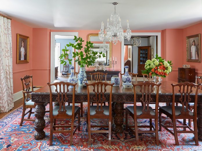
“Save the dining room!” is the rallying cry of Molster for 2019. She explains: “I rue the day when dining rooms started being sacrificed for a bigger overall ‘great’ rooms—not so great. Properly delineated spaces for dining encourage us to do just that: sit down and break bread with the people we like and have real conversations, preferably with tables set and candles burning. In our hectic lives, spending more time at home having real meals around a table is healthy for the soul, as much as the body.”
__Michael Cox, Foley & Cox__
All that glitters is not stylish to this New York designer. “Enough with the metallics,” says Cox. “Let’s go back to soft, matte fabrics that have a beautiful hand and subtly please our fingertips rather than sparkling our eyes.”
__Janice Parker, Janice Parker Landscape Architects__
Greenwich, Connecticut-based landscape designer Parker is growing weary of one ubiquitous garden element: Boxwoods. “2018 has seen just about enough of massive boxwood plantings,” says Parker. “We need to move on to other ornamental solutions for the backbone of our landscapes; we have no choice! Bark interest, leaf color, branching structures, and forms of plant materials can be used to create the holistic sweeps and form of the garden—we need to be open to change, because it is here.”
__Sig Bergamin, Sig Bergamin Architecture & Design__
“In 2019 I hope not to see thematic design: Interiors inspired by the 1950s or 1960s in which everything refers to that period, houses decorated all in black and white,” says the designer, who is known for being at the opposite end of the minimalist, monochrome spectrum. “With anything that takes inspiration too literally, everything is very tacky.”
A Keita Turner-designed room at the Essence show house featuring varied textures and hues.
Photo: Courtesy of Keita Turner Designs
__Keita Turner, Keita Turner Design__
Enough with the all-white interiors of Instagram, says this New York designer. “I hope to see fewer whitewashed rooms and homes with little to no color saturating the social feeds in 2019,” Turner tells AD PRO. “While we understand the attraction to this clean look, quite frankly, we are ready to Wite-Out this uninspiring trend. In our opinion, rooms should have color, personality, evoke a sense of fun adventure and make you feel happy. So out with this boring palette and in with the new and interesting, chromatic colors!”
Colorful woven bowls on the wall of a project by Brooklyn duo AphroChic.
Photo: Genevieve Garruppo
__Jeanine Hays and Bryan Mason, AphroChic__
The designers behind Brooklyn-based AphroChic agree: “Neutral-dominated spaces,” answers Mason when asked what he hopes to leave in the past. “True, they are frequently beautiful and meditative. True that our concept of neutrals has expanded in recent years to include more colorful options, including a few pale pinks. Yet by and large, American design is marked by a trepidation about color that keeps us from exploring the possibilities of what more vibrant tones could bring to our spaces.”
“On some level the aversion is understandable,” continues Hays, his wife and business partner. “It can be sort of a high-wire act—learning to use and use strong colors in a way that feels balanced and sophisticated. But when it’s done well—and more than a few designers have done it exceptionally well—you find yourself wondering why we don’t do it more often. Hopefully, beginning in 2019, we will.”
__Mally Skok, Mally Skok Design__
“The appropriation of Africa and African style by people who are not invested in the continent and its artisans,” says the Boston-based designer, who was born and raised in South Africa. “Suddenly Africa has become terribly chic and there’s this this new appropriation of African goods which really upsets me, because Africa is so plentiful in artisan things,” explains Skok, urging consumers to go to the original source. “Don’t just borrow from Africa and not have the money flow back to the brilliant artisans and craftsman of that continent. These are things that you can buy off the internet easily or at markets down the street; there’s no need to buy copies at TJ Maxx.”
__Amanda Lantz, A Lantz Design__
Lantz is completely over “overstated decorative lighting. Dial down the awkward geometric shapes and stop attempting to make statement with every fixture in the house,” she says. “Good design is not only about the light fixtures; it’s about the cohesiveness with textiles, colors and finishes.”
A bold painting in a neutral room by Marie Flanigan.
Photo: Julie Soefer
__Marie Flanigan, Marie Flanigan Interiors__
Shockingly, this Houston designer is telling us to neglect décor—in one specific instance, that is. “Art that matches décor” is Flanigan’s pet peeve. “The monochromatic look has been having a moment—and for good reason,” she says. “It celebrates a sense of unity within a space and can be a wonderful way to highlight texture and light. But 2019 is the year for neutral palettes to be ignored when it comes to art. Bringing a piece of art home should be a very personal experience, and selections made with no regard for surrounding decor. Go for pieces that lend interest and contrast to your home’s established palette and revel in the statement for years to come!”
__Brigid Coulter, Brigid Coulter Designs__
“Please press pause on the pervasive golden-brass palette, people,” urges Venice, California-based Coulter. “Golden-brass fixtures, fittings, equipment, hardware, and trim is lovely in moderation, balanced within a reasonable scale! But the trend to accent everything in golden-brass will hopefully take a momentary rest.”
A richly-hued living room by Tina Ramchandani.
Photo: Jacob Snavely
__Tina Ramchandani, Tina Ramchandani Creative__
For New Yorker Ramchandani, the offending trend is “misguided pops of color.” She explains, “Color is a beautiful tool and should be used thoughtfully. I’m over super-neutral rooms with a few colorful accent pillows! If you’re going to use bold colors, fully integrate them within the design concept from the start as opposed to haphazardly injecting them at the end.”
__Cathy Austin, Catherine M. Austin Interior Design__
“Pessimism,” says Charlotte, North Carolina-based Austin when asked what she hopes not to see in 2019. Visually speaking, that translates to “cool tones and hard edges,” the designer explains. “Our culture is suffering from depression fatigue. Anything cold such as gray tones, industrial finishes, and mass produced items are out. Bring back warm tones, soft edges, and comfort!”
__Nicole Fuller, Nicole Fuller Interiors__
Fuller has a big-picture hope next year. Her answer? “Trends! I believe in designing timeless interiors that are exciting and unique for all of our clients,” she explains. “OK, but if I had to say [one trend], please don’t show me any more ‘hotel art’ in a space. It’s better to leave clean, white walls unless there is something important to say. Being eclectic doesn’t meant cluttering up your walls and/or space in any way. For me, it means you need to channel your inner self, edit and create an amazing space that you can breathe in.”
More from AD PRO: Has Instagram Made Design Shows Better?
Sign up for the AD PRO newsletter for all the design news you need to know


