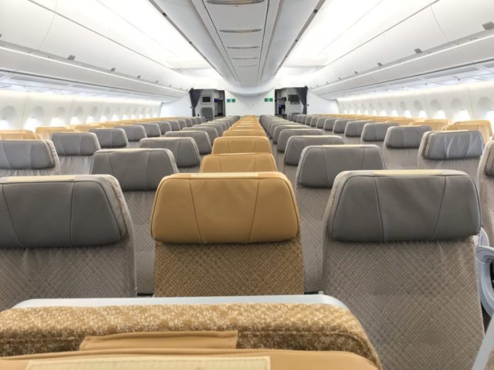
 For many years airline cabins have trended to cool tones in shades of grey, beige, blue, green, purple and pink. Consumer trends suggest that it could be time to bring some warmth back on board.
Shades of amber, rust, wood and copper were all the rage in the 1970s (and helped hide nicotine stains) but airlines have largely abandoned them. We wouldn’t necessarily suggest a full-fleet retro revival, but home decor, consumer electronics, and fashion trends show that warm is getting hot again.
Apple’s choice of antique gold for the new iPhone XS and Apple Watch 4 collection got our attention. The company has used gold tones on previous models – think rose gold iPhones, laptops and watches – but the new color is warmer, deeper, with hints of amber.
The thermometer is also rising in fashion. Pantone’s 2019 fashion forecast pops with heat. There are warm tones for every color of the rainbow and the Pantone forecast reflects that. We shouldn’t be surprised if the 2019 color of the year came from this range.
Home decor has sensed the temperature warming too. The home color trends for 2019 include neutral colors with a warm base as well as warm pinks and reds, appetizing mustard, tangerine and pumpkin, complemented by gold and copper metallic accents. Natural wood as well as tan, amber and cognac leathers are welcome. Cool tones that are integral to the space are warmed up with details and decorations. That’s fitting to the aircraft cabin where any change is expensive.
We have seen shining examples of color experimentation as some airlines give the color wheel a creative spin.
Take the Singapore Airlines cabins by JPA design, as an example. The airline’s colors are royal navy with purple undertones and gold, but you see the values of those colors in the cabin not the colors themselves.
Instead, there are cool and neutral colors in economy blended with rich earth tones and varied as the seats progress towards the back, from brown to lighter shades of tan and then honey. The color variation, provided by innovation in thermoplastics and materials, also creates visual interest. SIA’s premium economy cabin has a clay grey base trimmed with turquoise and tangerine. The business class clam shell seat glows with a warm pearlescent rose, and golden light shines on copper details. A decadent mix of cream and chocolate infuse the new A380 first class suite. Cooler metal finishes are complemented by soft white gold wall details. A bright orange back cushion is the perfect highlight.

SIA premium economy. Image: Marisa Garcia
Of course, Emirates and Etihad have put gold tones to work as an emblem of luxury, but warmth can (and often should) be simple. When Southwest Airlines first introduced leather seating, the TEAGUE saddle back design complemented a rich navy with a toffee tan.

Warmth could pop in on headrests or antimacassars or cushions. A few warm threads woven in can change the feel of neutral or cool seating fabric. Change could be as simple as a warm stitching detail (Air France understands the benefit of a subtle stitching accent).
Today, the broad range of programmable lighting on modern aircraft can lend a helping hand.
Finnair varies the light effects from Northern lights to a warm red and gold according to the phase of flight. The cabins themselves are neutral and pale, allowing both the light show and the windows to do the heavy work.
Lufthansa has accomplished a similar thing with its gold lighting effects. The silver dots on the airline’s wall panels work like tiny mirrors, reflecting whatever light predominates.
When USAir changed its branding to USAirways in 1996, it introduced fabric seat covers with grey on grey stripes and blue and red bars at the center to recall the flag. When the fabric rolls came in, this writer feared the effect would be drab. I was delighted during the first cabin inspection to see sunlight play off that weave, shining like an iridescent pearl. It was marvelous to be so wrong.
After all, what could be more fitting for the skies than tempering cool with a little bit of sunshine?

Inspiring colors in nature. Image: Marisa Garcia
Related Articles:


